If you’re looking to refresh your place this year, I have just the thing. Every year, all the big paint manufacturers choose a few colors which they expect to be the major trends for the year, or which they hope will set the tone for current designs. Ranging from your safe neutrals to bold color, you have a lot to choose from in this year’s group.
Valspar: Rock Solid
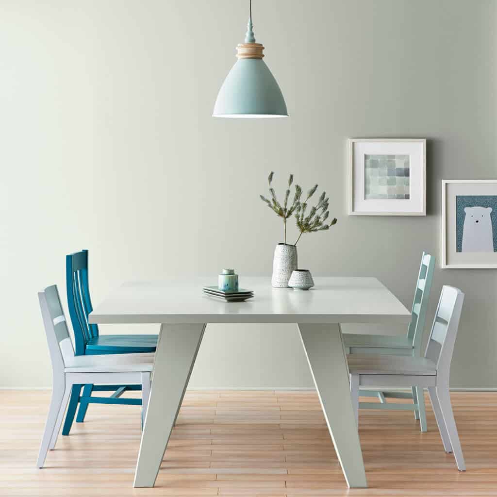
The great thing about this one is how it combines a couple of trends, making it a really smart marketing move by Valspar. Rock Solid is a sort of silver sage, so it’s sticking to the trend for gray, while also indulging in a bit of color. Where it really shines though is this soft edge and a bit of added brightness. This is a great color for smaller rooms or those that don’t see a lot of natural light, because it will naturally make the room feel more spacious. I think this will be a popular color for bedrooms, living rooms, and bathrooms because it lends itself well to creating a calming atmosphere, but it’s also neutral enough that you can pair it with pretty much any accessories.
Sherwin Williams: Poised Taupe
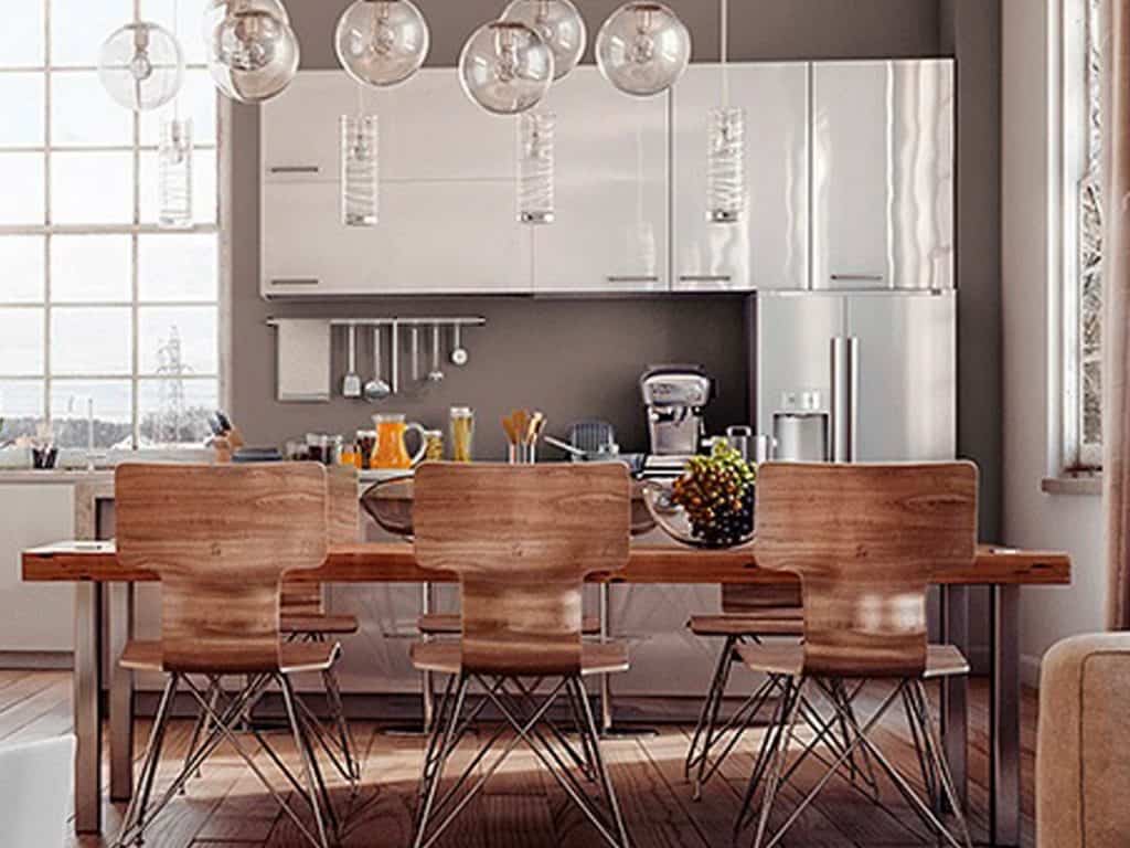
From Sherwin Williams, we have a dark neutral that straddles the lines between warm and cool, gray and beige. This is an expected choice since the trend for neutrals has been slowly moving from gray to greige to taupe. This one is a bit on the dark side though. The LRV is 23, so it’s good for rooms that already get a lot of light since it’ll brighten up a bit without becoming overwhelming. You do run the risk of making a room on the dreary side, so be sure to dress it in a good white or some pale woods. There’s an earthy sophistication to this color, so I expect it to be popular with those who tend toward a more rustic style in their kitchens and living rooms.
Dunn Edwards: Honey Glow
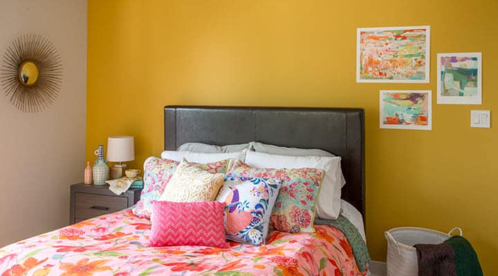
This one is exciting for those who are tired of seeing neutrals for days. Decor trends are becoming more globalized every year, and we’ve seen a noticeable increase in the demand for styles from northern Africa and South Asia. Fortunately, this also means that bold primaries and jewel tones are coming back into style. Dunn Edwards has chosen this bright yellow which is mellowed by some orange-tan undertones, grounding it without sacrificing its inherent levity. It’s a sort of saturated mustard that exudes this youthfulness without looking immature. Obviously, it’ll be most popular in rooms for kids, bedrooms especially, as yellow often is, but I can easily see this on accent walls throughout a house.
And I haven’t even told you the best part. Dunn Edwards is donating 10% of the profits from Honey Glow to HoneyLove, an organization working to protect bee populations in North America.
Pantone: Greenery
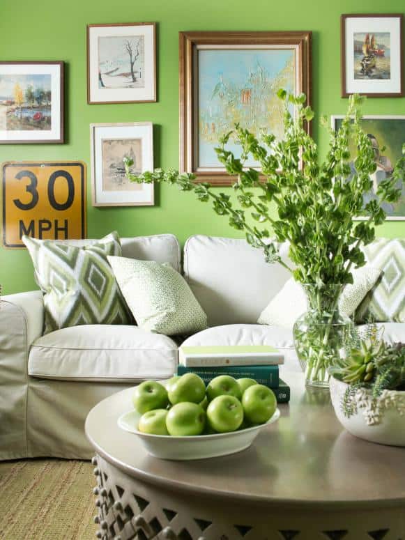
Speaking of bright colors, we now come to Pantone. I spent years in film school, and this is the exact color we used for chroma-keying. Of all the color picks this year, this one has definitely been the most polarising. Some people think it looks overbearing and childish. Others call it fresh and light. I don’t expect that many folks to embrace this one so fully as to paint entire rooms with this, but I think it could definitely become a popular accent color. Reds and teals have been the go-to for “pops of color” in the last few years, and I think a lot of people are feeling the need for something new. Not to mention how easy it is to incorporate a few plants into your home, this one may just have some staying power after the others have faded as trends.
Benjamin Moore: Shadow
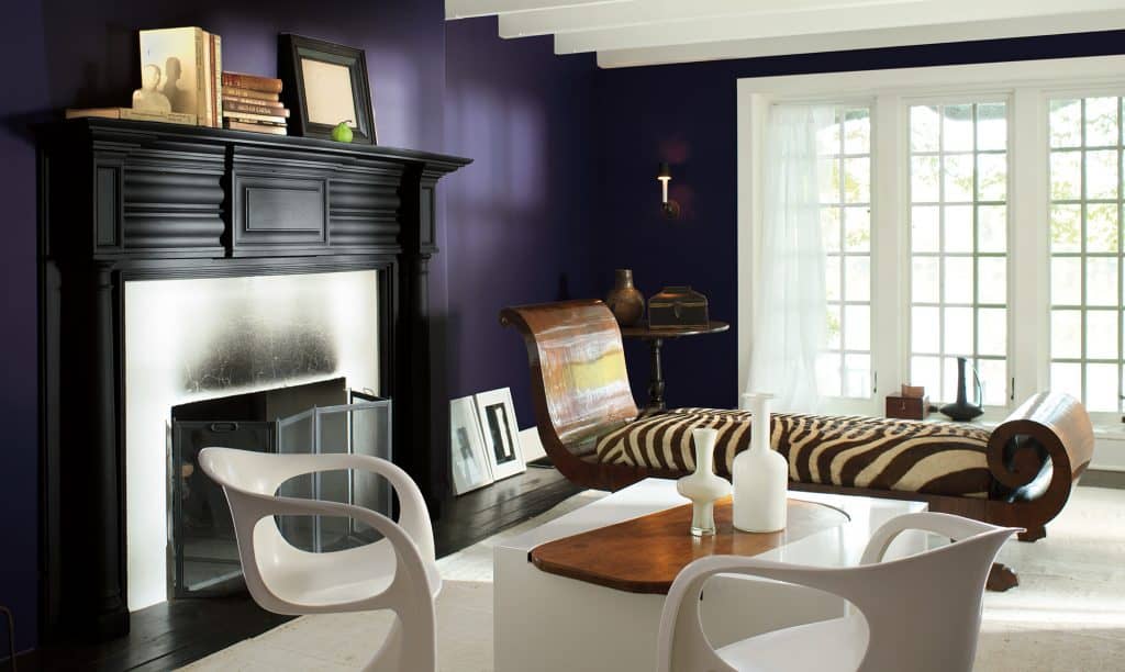
Of everything on this list, I saved my favorite for last. BenMoore brings us a deep, rich purple of the eggplant variety, a huge shift from their white pick last year.
This one will be a hard sell for most people, I can tell. Not everyone is as passionate about purple as I am, and the vast majority of people are hesitant about using such dark colors, for fear that they’ll turn rooms into caves. But I have the paint chip in front of me right now, and it’s only about halfway down the card. The LRV for it is 7.9, so it’s really dark, but it won’t swallow the room when used strategically. You definitely won’t want to paint an entire room with this, unless it’s the display room for your lamp collection. But an accent wall, a ceiling, a door, all great choices. You only need a little bit to create some dramatic contrast.
Something that would be a very brave, but I think a stunning choice, would be to use it in a white kitchen. It’ll make your white cabinets and counters look all the brighter, and they’ll help balance out the lighting.

Let us know if you’re looking to make some bold changes, or trying out some new colors. Which of these is going to be your 2017 color of the year? Do you have an unconventional favorite that’s going to take the design world by storm? I’d love to hear about it. If you’re interested in some alternative choices for your walls, I wrote a feature on trending wallpapers earlier this month that might be of interest. And, as always, best of luck as you imagine, design, and build.

