Choosing paint for your home improvement project can be one of the most daunting experiences with the thousands of available color options especially once you factor in style and personality. Add in fixtures and furnishings and the task of selecting a color becomes even more challenging. Our natural tendency is to complicate things that should not be complicated by understanding simple rules and principles of color, decor, and decorating we can remove the complexities and achieve the desired effect. Read on as our interior designer Austin Curry provides some great tips to create a color palette that best suits your style and personality.
Start with the Basics of Understanding Colors & Color Schemes
There are three types of colors, primary, secondary and tertiary colors and there are basically 4 types of color schemes, Complementary, Analogous, Contrast, and Monochromatic each having their own unique characteristics from the color wheel. There are no hard and fast rules over how to choose a color scheme, but if you understand the basics, it will open the possibility of breaking accepted conventions in order to achieve a specific effect.
How colors are made?
RED | BLUE | YELLOW are Primary colors that can not be created and are pure colors.
GREEN | ORANGE | PURPLE are Secondary colors that are created when any 2 primary colors are combined in equal parts.
Finally, Tertiary colors are created by mixing various parts of primary and secondary colors which create the different hues, additionally white or black may be added to darken or soften the hues.
What are color schemes and how to use them?

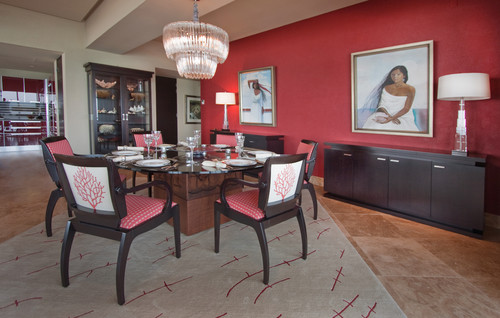
- Complementary – This type of color scheme is usually very dramatic and bold created by using two opposing colors, for example using Green and Red or Purple and Yellow. This type of scheme is very drastic creating a radical and extreme effect.
- Contrast – The scheme uses a mixture of two or more colors from different segments of the color wheel. Example: Red is the warm half while blue is the from the cool half. The contrast color scheme adds more color and energy to the palette.
- Analogic or Analogous – This color combination provides a very soothing feel since it uses colors that appear next to each other on the color wheel, also this scheme is a triad of colors, a good example is blue used with green and purple or red with orange and yellow.
- Mono Color or Monochromatic – This color scheme is the most complex since it uses a single color with the addition of white or black to lighten or darken producing a sophisticated and relaxed design of hues. Example: Start with Red moving towards a light pink or a dark maroon and all three hues of the same shade are used.
Choosing your color scheme
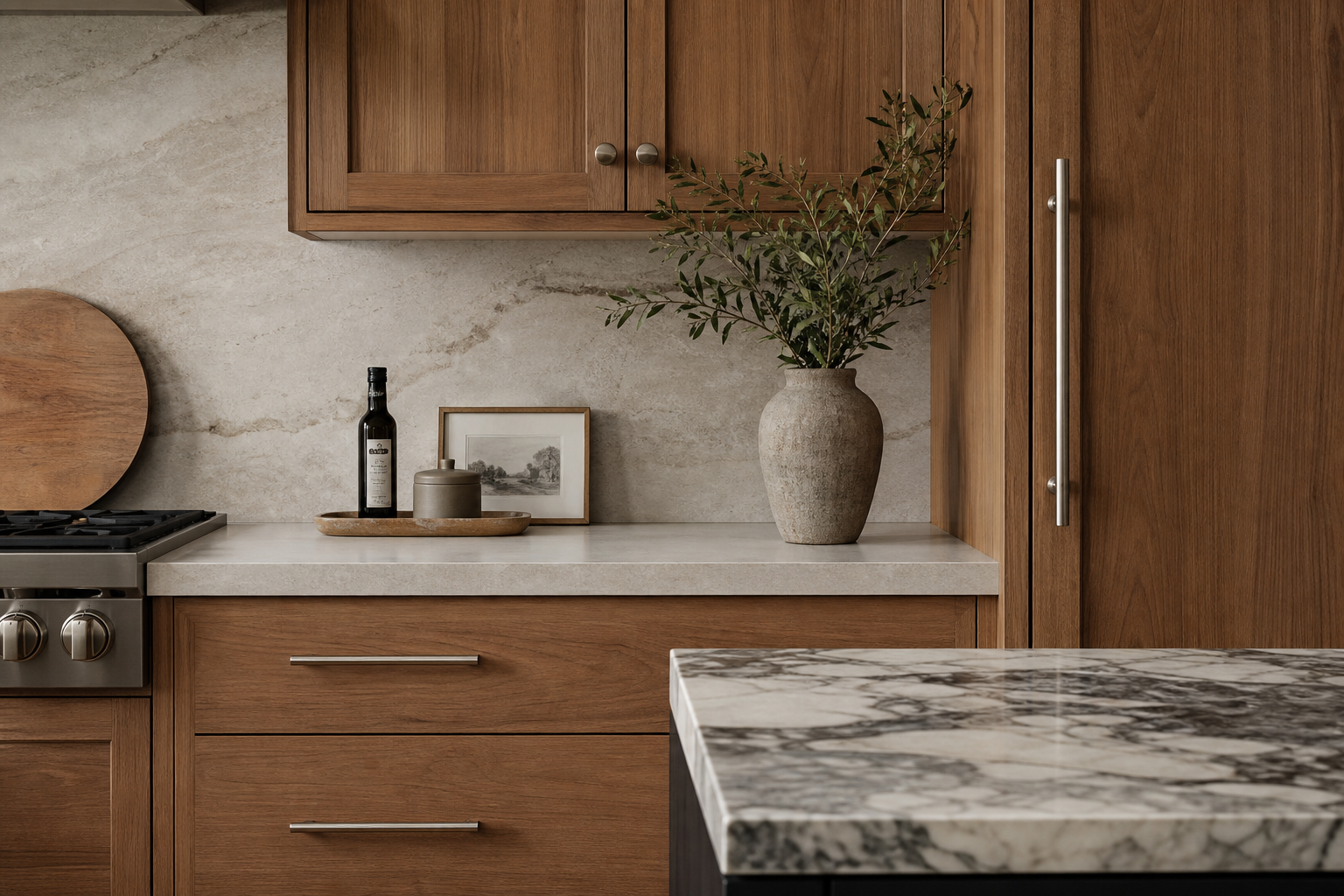
Now that we have the basic idea of how colors are created and the types of color schemes we can start to create your custom color scheme. One mistake we see time and time again is most clients start by selecting the wall color first. Wall paints are inexpensive and can be created in any color and in any hue to match the overall room decor. Our recommendation is to start with the furniture and rugs or carpets. Once the furnishings are complete then you can work on the wall color, this will remove much of the complexity.
Quick Tips
- Contrasts – Start with Dark Color and Pair with a light color
- High Energy Look – Simple as adding something bright to the room, like a rug
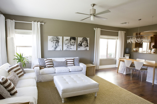
- Pale Walls or Neutral – Then you can bring color in with rugs, furniture, lamps, pillows, throws and artwork, flowers, and fresh fruit.
- Bolder Look – pick colors that provide crisp and clean lines
- Subtle – Then use softer, neutral shades
How to test your color choices and color palette?

- Use Paint Swatches and Fabrics to test various color combinations.
- Draw out plans of your rooms and sketch in the colors, this will provide a visual of what the room will potentially look like.
- Taking a photo of the room and using online tools like Colorjive can also help you visually see the overall outcome of the room.
- Once you create the visuals and are happy with the outcomes we advise painting small areas of your walls.
- Paint sample areas that connect to other rooms to create a flow from room to room so that the colors complement each other.
These days all paint stores provide some form of paint swatches for various tones or paint cards. Feel free to grab as many of them as you want even all of them if you choose. Trust me they will not mind since it makes their job easier in mixing the correct paints for your desired color.
Factor in lighting
Both natural light and artificial light are major aspects of color, decor, and function within the home. Both types of lighting reflect and deflect color, while natural light changes constantly, throughout the day. Natural light will show the truest colors during the daylight hours and will also alter the hues throughout the day and during the various seasons. Artificial light also has variances in color throughout a room since most homes have different types of lighting fixtures and bulbs throughout a given space.
So where to start with color?
- Start with a Central Room or Front Hall, Foyer or Entryway
- Are there colors that you really like?
- Do you prefer specific certain shades of colors, yellows, greens, reds, etc.?
- Important start with a color YOU like not what someone else likes or has used? Remember you have to live it
- Try variations of the colors you like by selecting several shades and hues of a lighter color and a few shades, hues darker.
- Separate floors and paint your landings and hallways a soft or neutral color
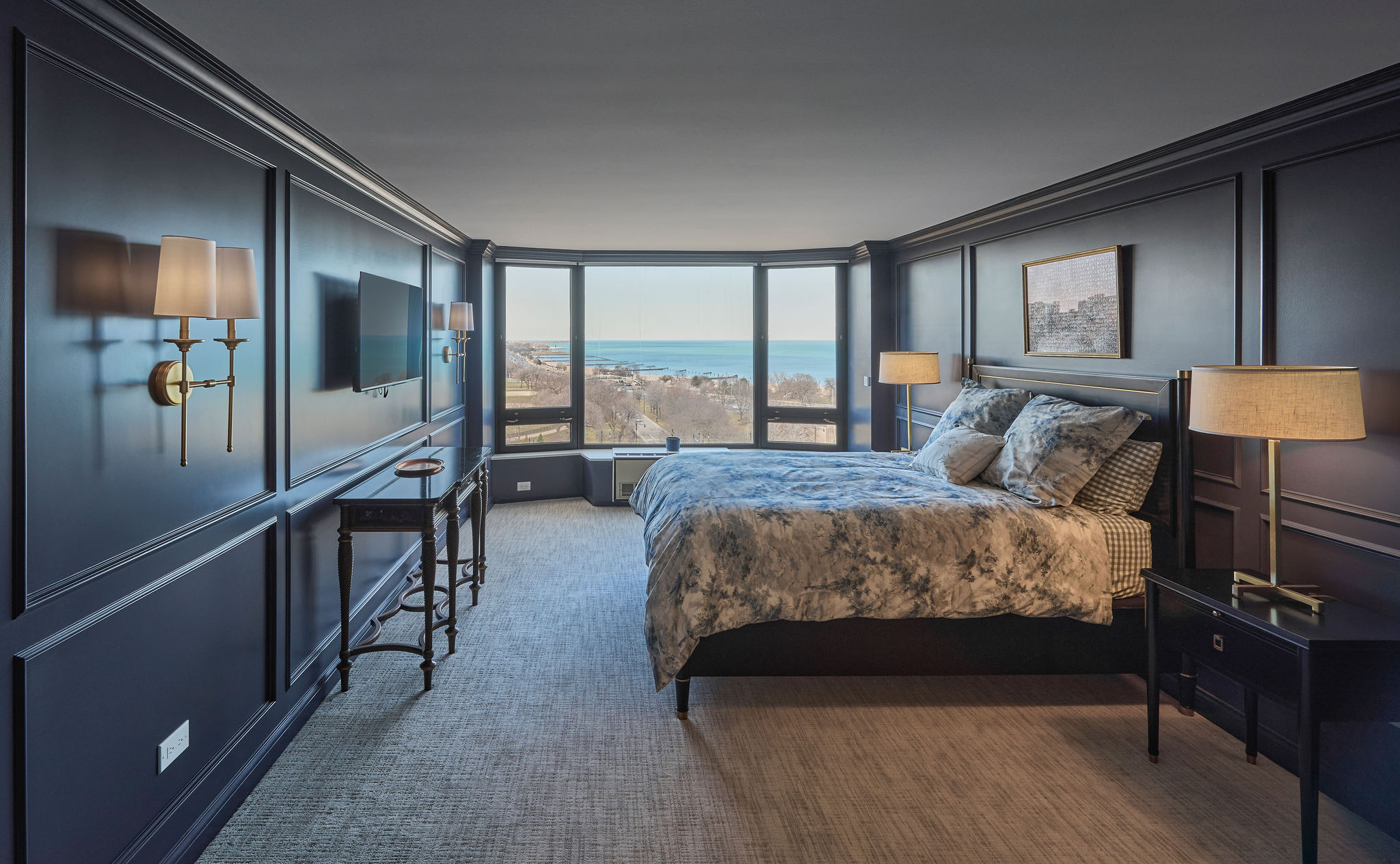
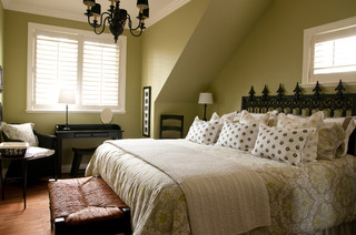
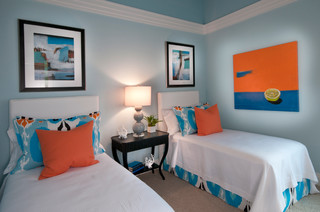
- Bedrooms will generally have different colors and contrasts
- If your master bedroom has a master bathroom attached, it’s not required to paint both the same but rather consider different tones, hues of the same color.
Once you have selected your set of colors, perhaps select one hue for the kitchen and one for the dining room, and if these are together then use the next adjacent room like the living room. To make it flow select a neutral that can be used in both rooms for ceilings and trim. Many interior designers will suggest keeping common areas like hallways, landings, and connecting spaces neutral in tone.
We hope this guide helps you pick your color scheme and if you have any questions please do not hesitate to ask in the comments below or contact us for professional interior design help.